
The Journal · Colour
Golden Brunette,
Caramel & Chocolate.
The expensive brunette conversation is really about dimension.
Words by Kiyah Wright · Founder, MUZE
Chapter I — The Misunderstanding
Expensive colour has never been about being lighter.
Every client who asks me for expensive brunette is really asking for depth. For light that moves through the hair instead of sitting on top of it. That is dimension — and dimension is a craft, not a shade on a chart.
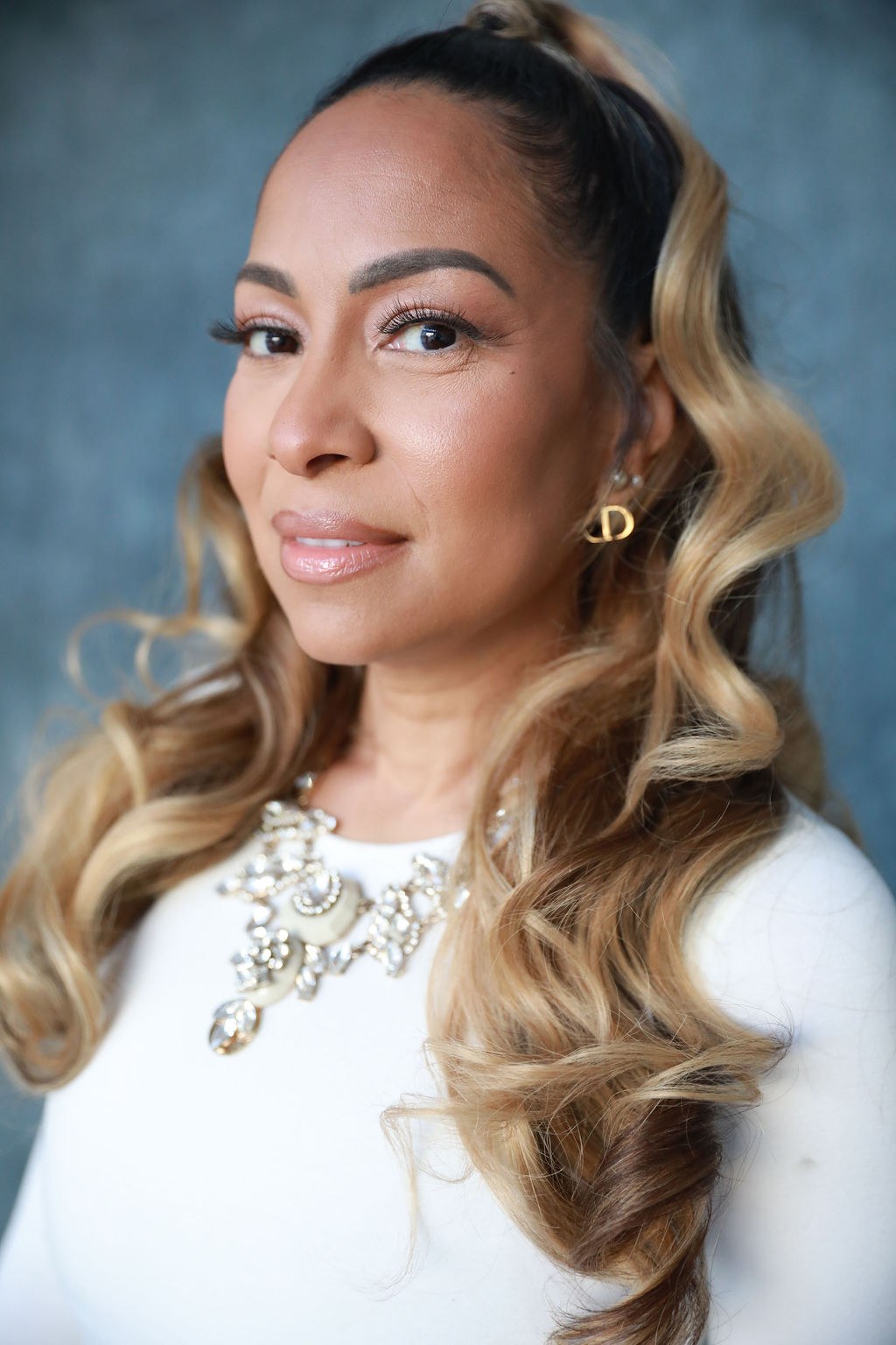
Tonal study · Studio
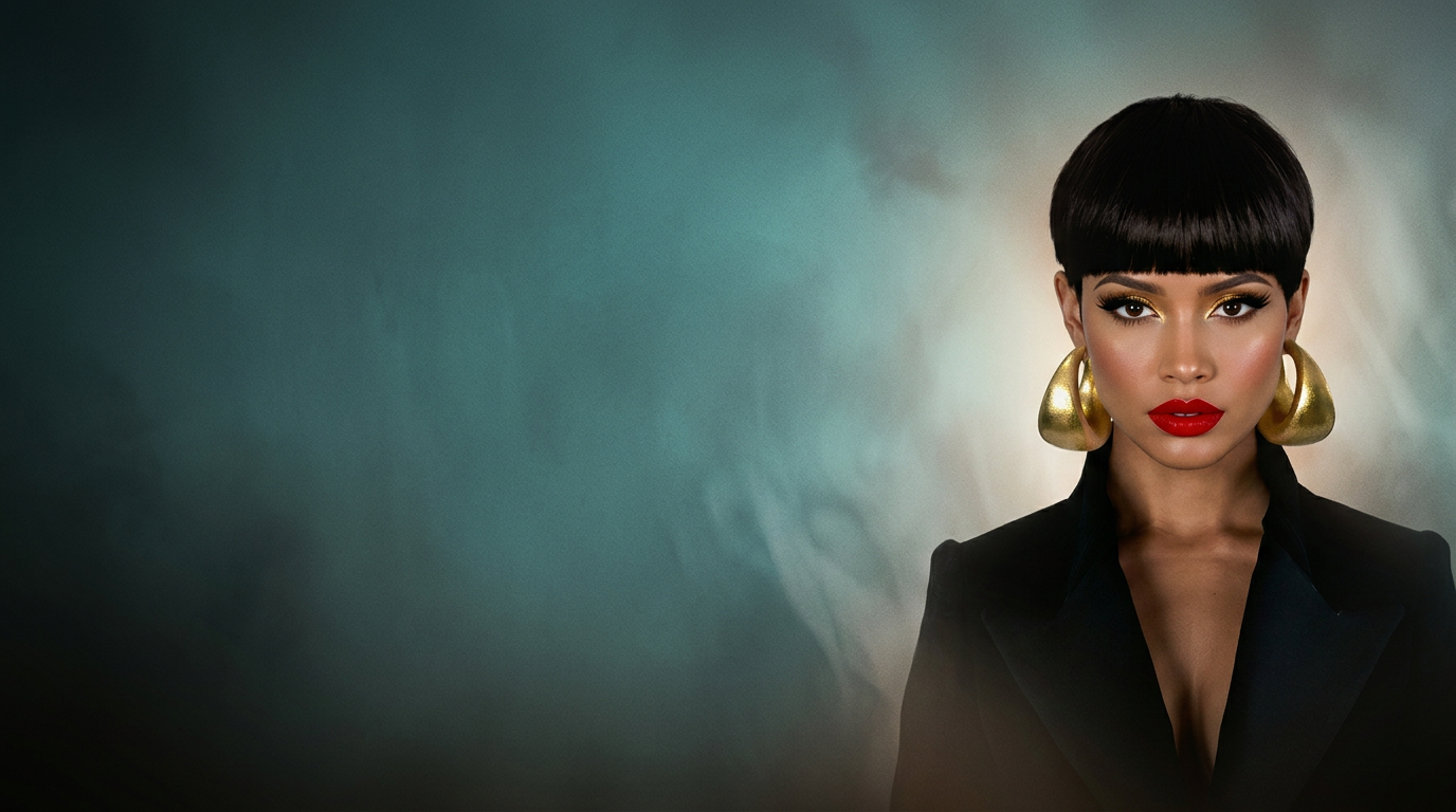
The Colour Issue
The Feature
The phrase arrived quietly and then took over: expensive brunette. Every timeline, every reference photo, every consultation. What is being described is rarely a colour at all. It is a behaviour — the way warm light travels from a deep root through caramel mid-lengths and settles into ends that still have weight.
Flat brunette is what happens when a single formula is asked to do the work of three. It photographs as a helmet. Dimensional brunette photographs as skin does: with shadow, with highlight, with places for the eye to rest. That is why it reads as costly. It looks lived in rather than applied.
Golden brunette gives the glow. Caramel gives the movement. Chocolate gives the authority. Remove any one of the three and the whole thing loses its argument. The most beautiful brunettes I have created were never the lightest ones — they were the ones with the most honest shadow.
And there is a cultural note underneath the trend. For years, warmth in Black and brown hair was called brassy and corrected out. Now the same tones are being sold back to us as luxury. My position has not changed: warmth was always the point.
“Depth is what makes light look expensive.”
Kiyah Wright
Chapter II — The Three Tones
Golden, caramel, chocolate. One formula cannot carry all three.
01
Golden brunette
Not blonde ambition — a warm light lifted only two levels, so the base still reads as itself. Best on skin with amber or olive undertones.
02
Caramel
The connective tone. Placed through the mid-lengths, it softens the line between root and end so nothing looks drawn on.
03
Chocolate
The anchor. Depth at the root is what makes everything above it look expensive. Take away the shadow and the colour goes flat.
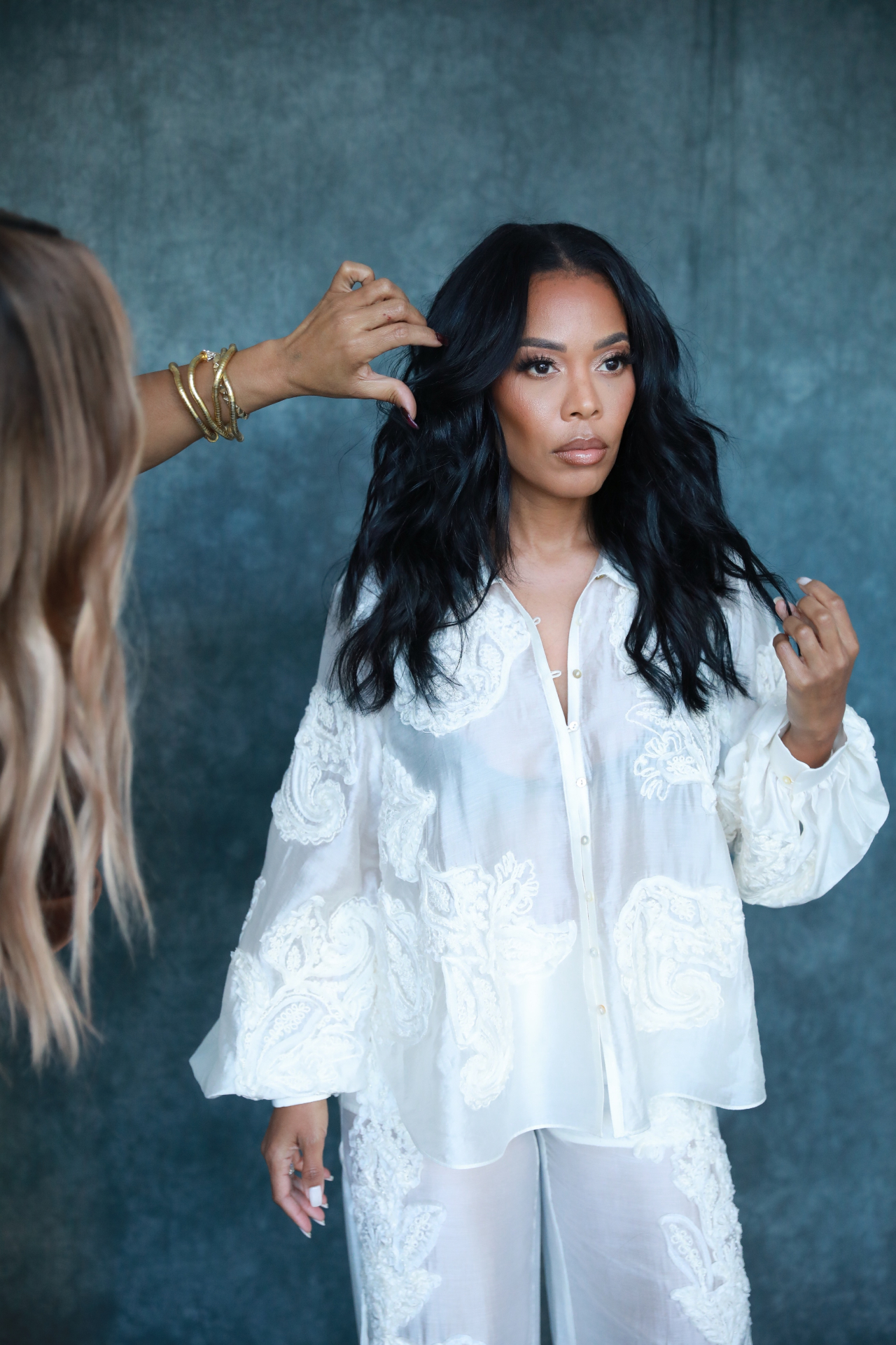

The Colour Portfolio
Keeping the Tone
Colour is only as expensive as its upkeep.
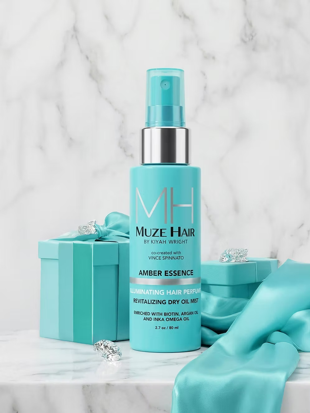
Amber Essence
Warm tones dull when hair is dry. Moisture is the first colour treatment.
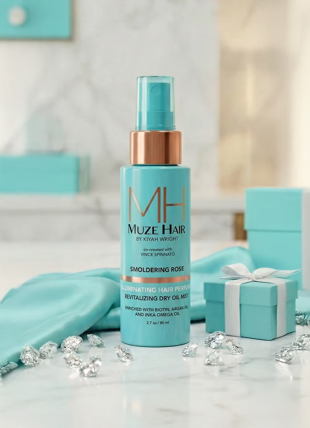
Smoldering Rose
A finishing veil for shine — dimension reads only where light can reflect.
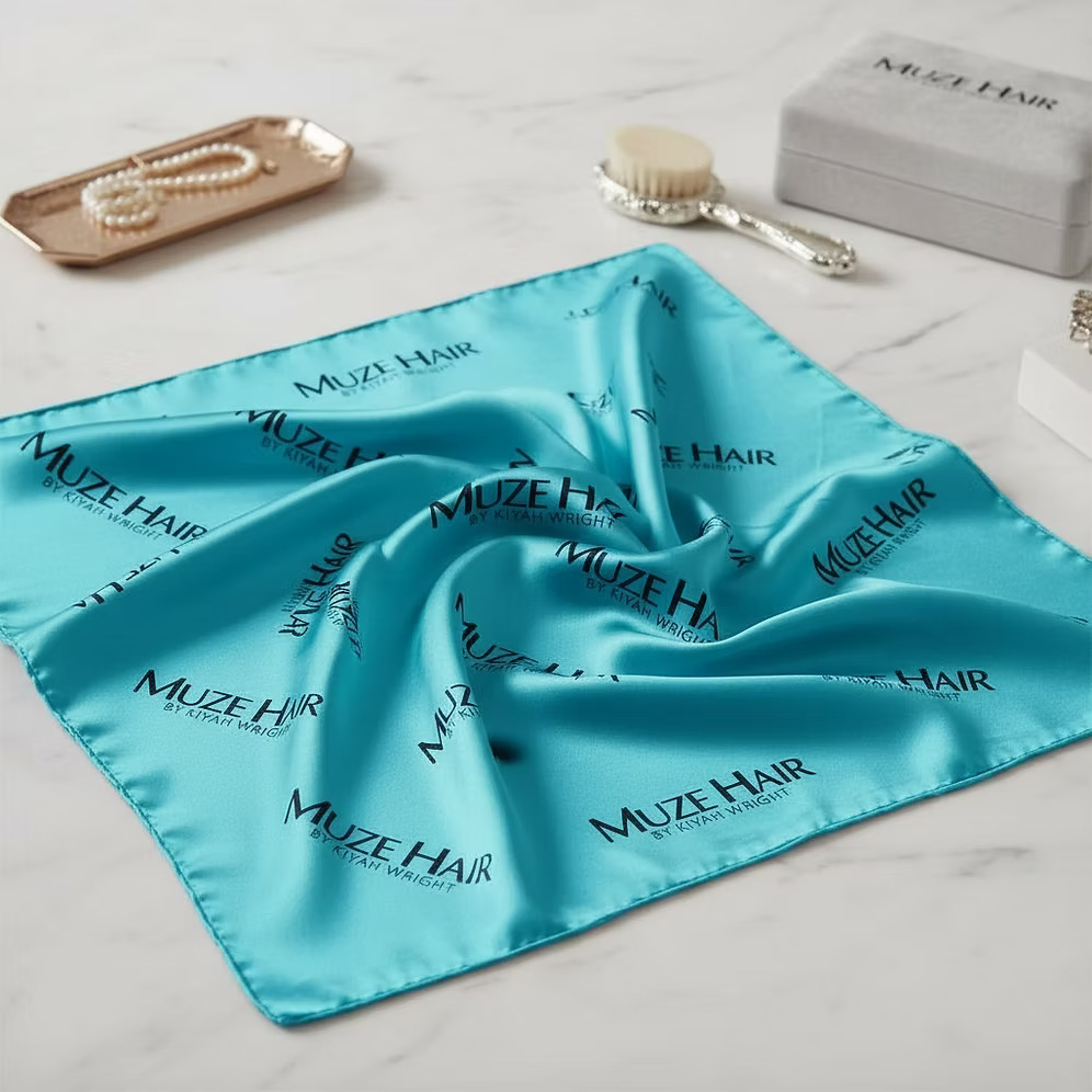
Satin Crown
Protect the tone overnight. Friction and cotton are what fade caramel first.
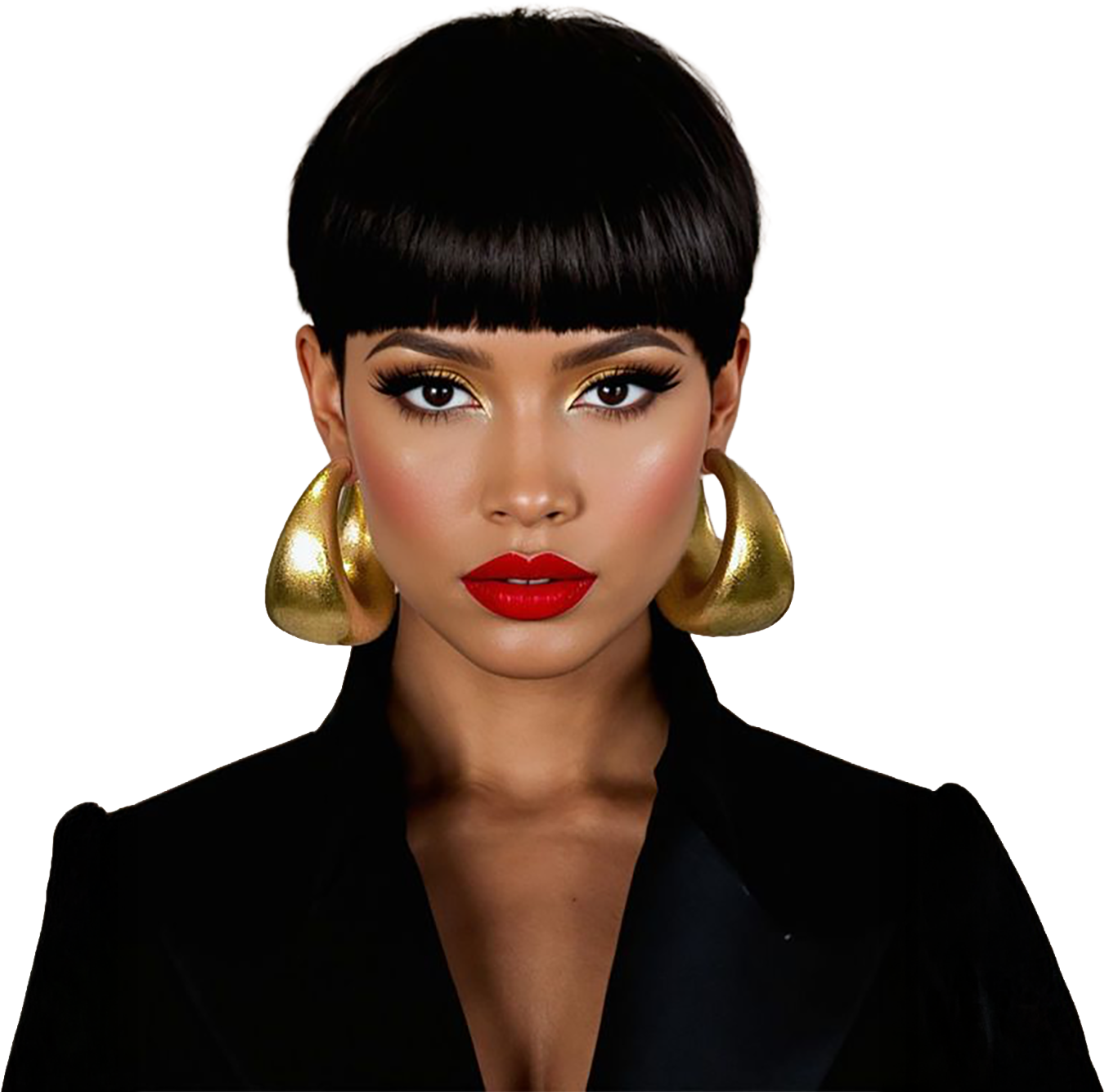
The Last Word
Nobody is really asking for brunette.
They are asking to be seen in three dimensions.
From the Founder
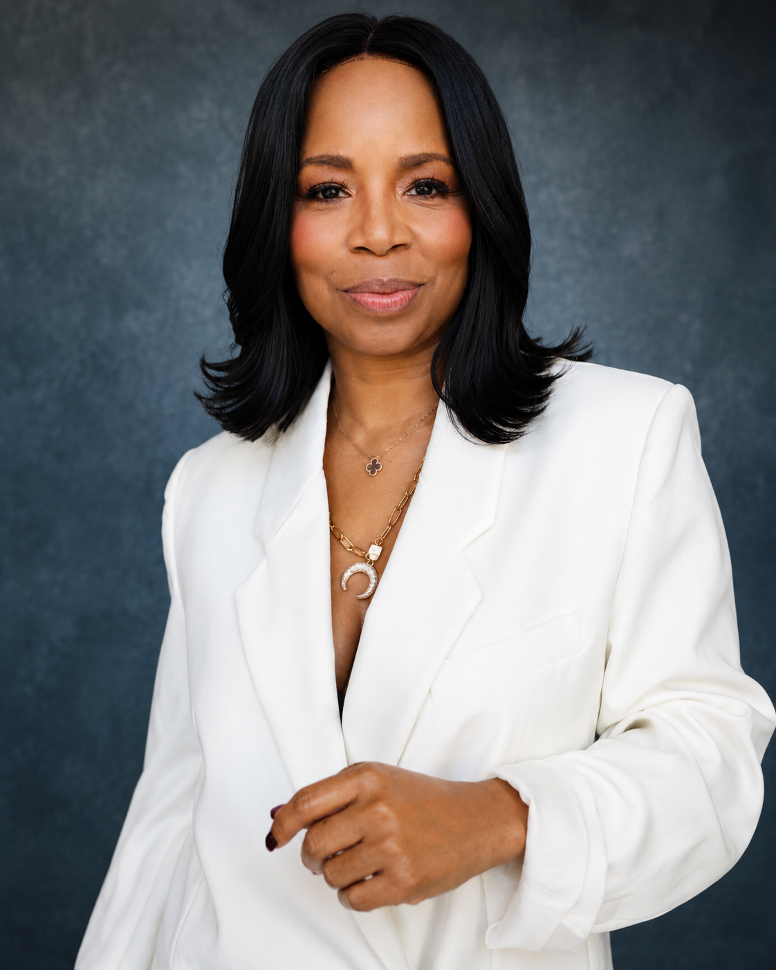
“I have never chased a shade. I build the shadow first, and the warmth becomes inevitable.”
Kiyah Wright · Founder, MUZE
The Series
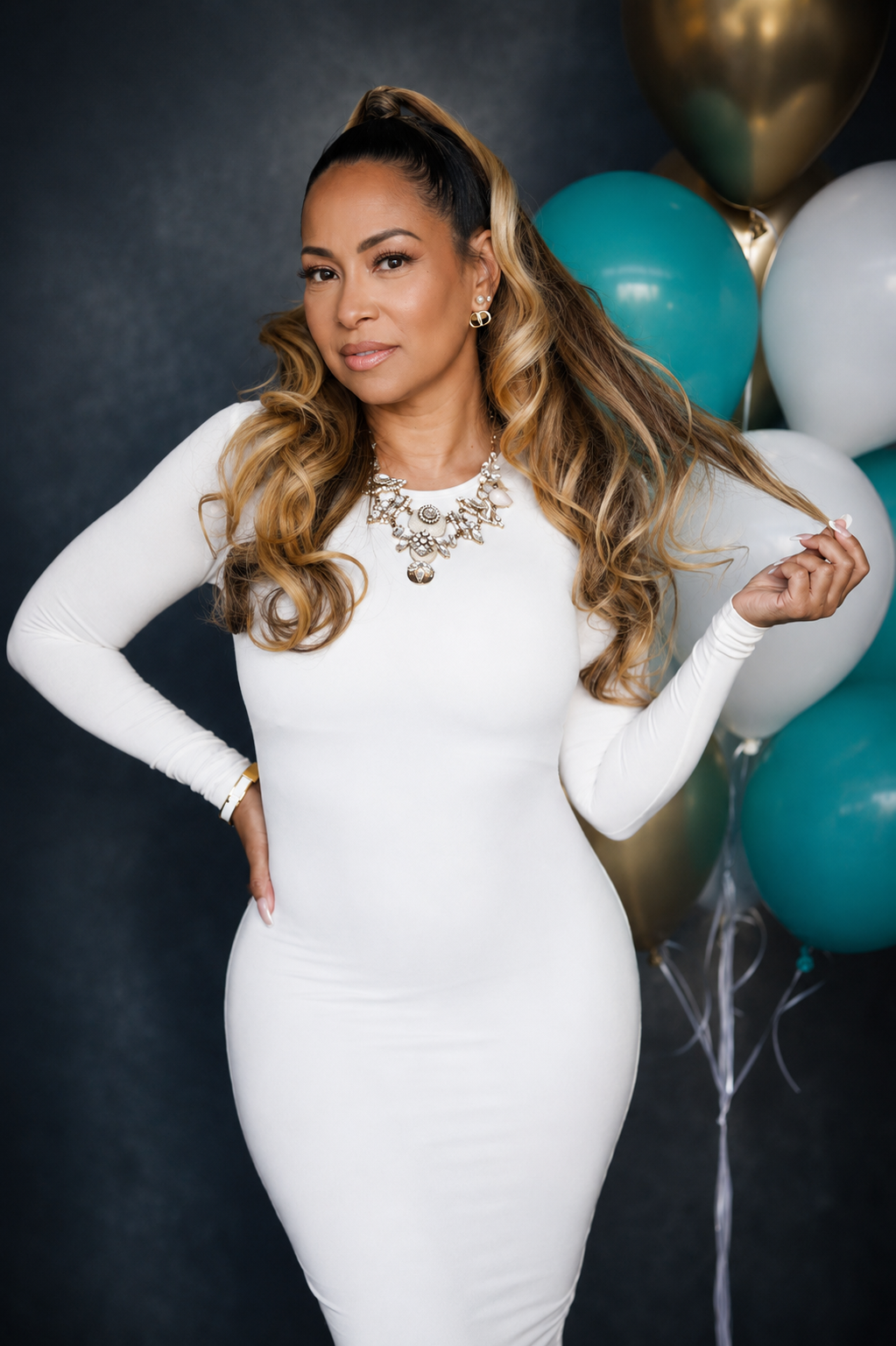
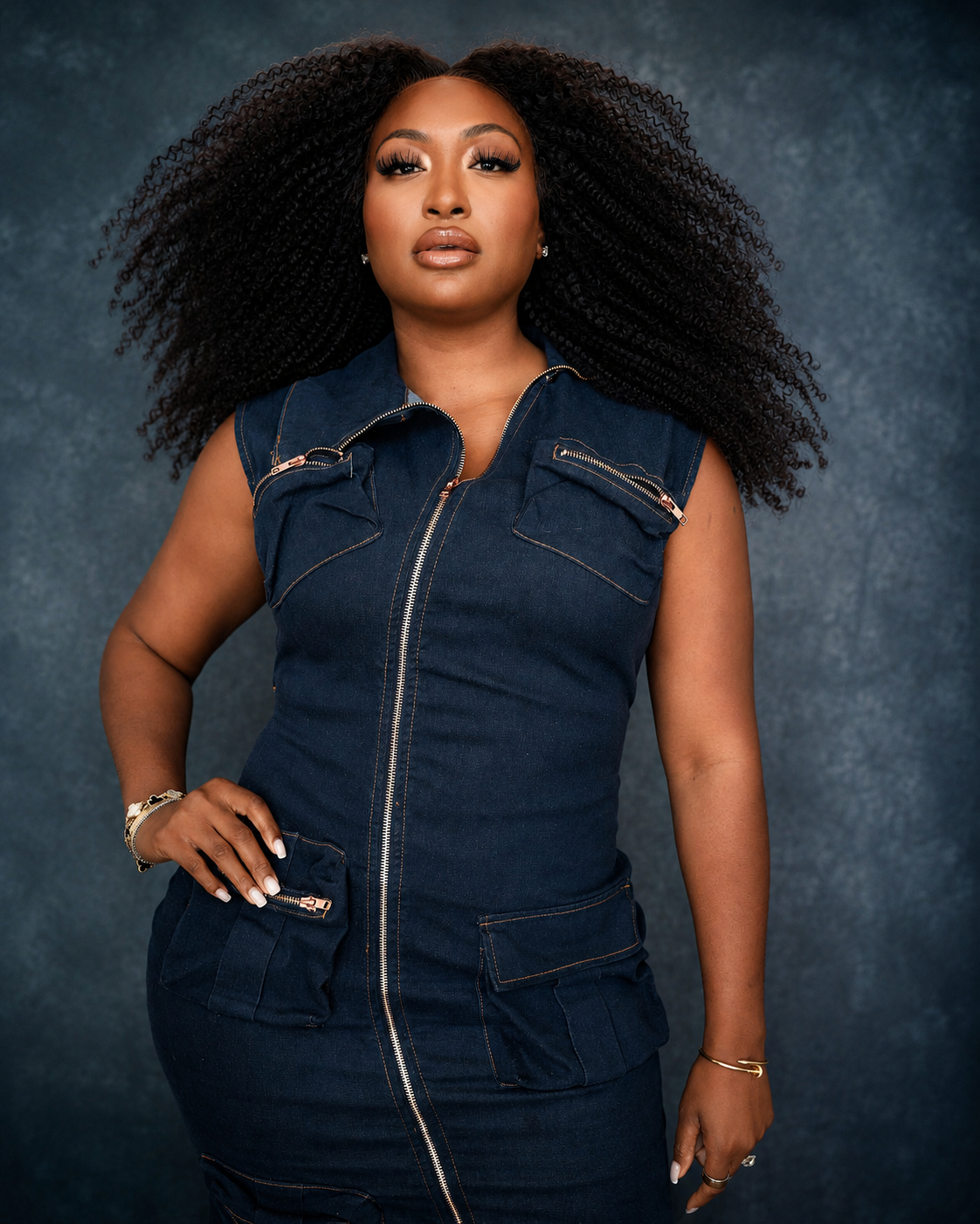
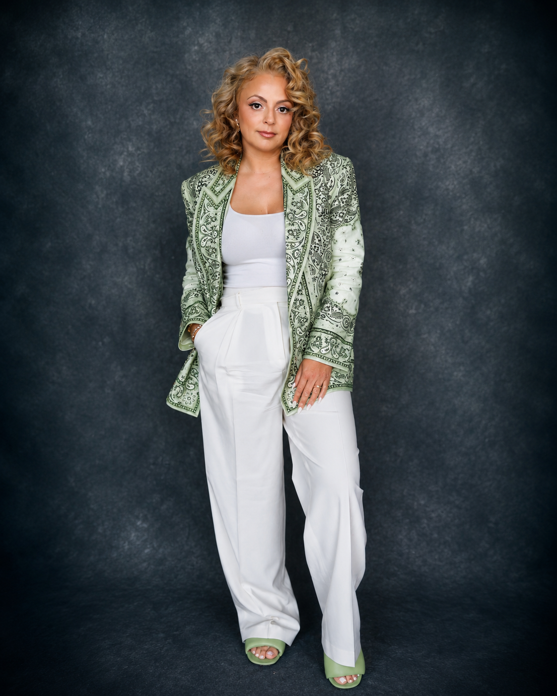
Women of MUZE.
A recurring journal series profiling women whose style, leadership, artistry, and personal stories inspire modern beauty culture — entrepreneurs, artists, executives, tastemakers, cultural leaders, beauty innovators.
Submissions
Nominate a Woman of MUZE.
Tell us about a woman whose presence has shaped the room you stand in.